Manual code is so old school
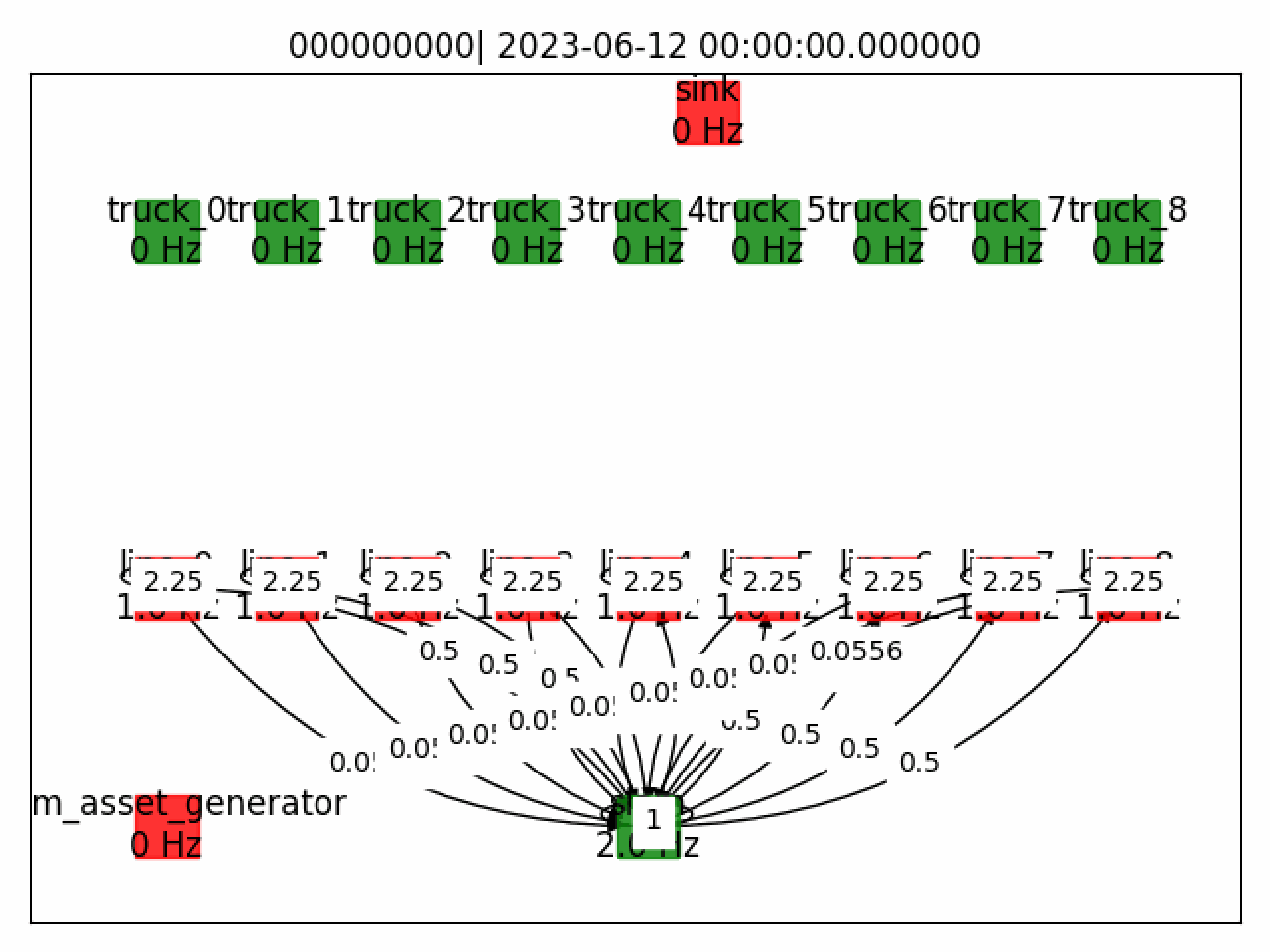
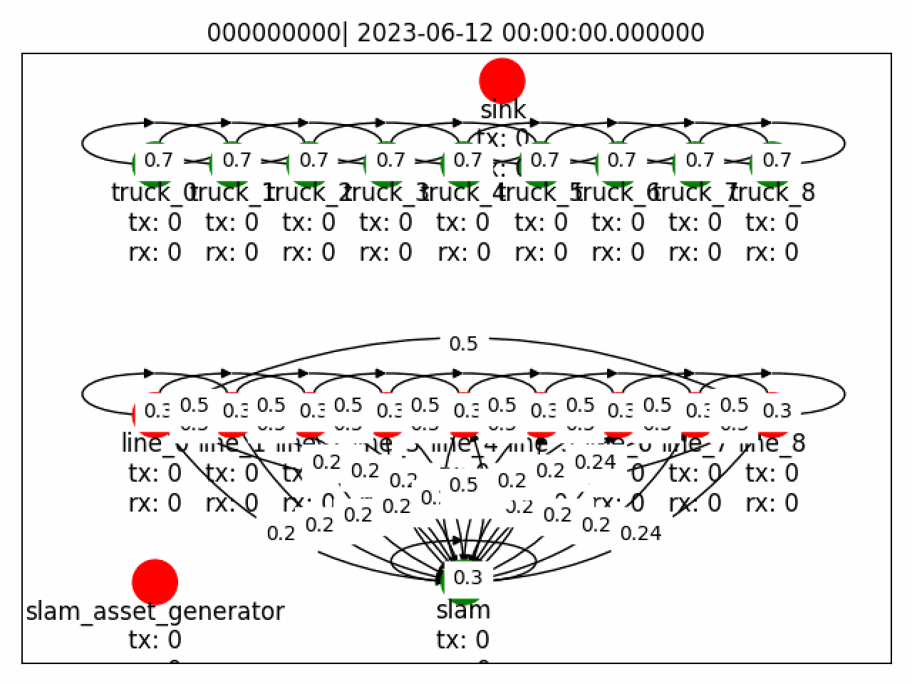
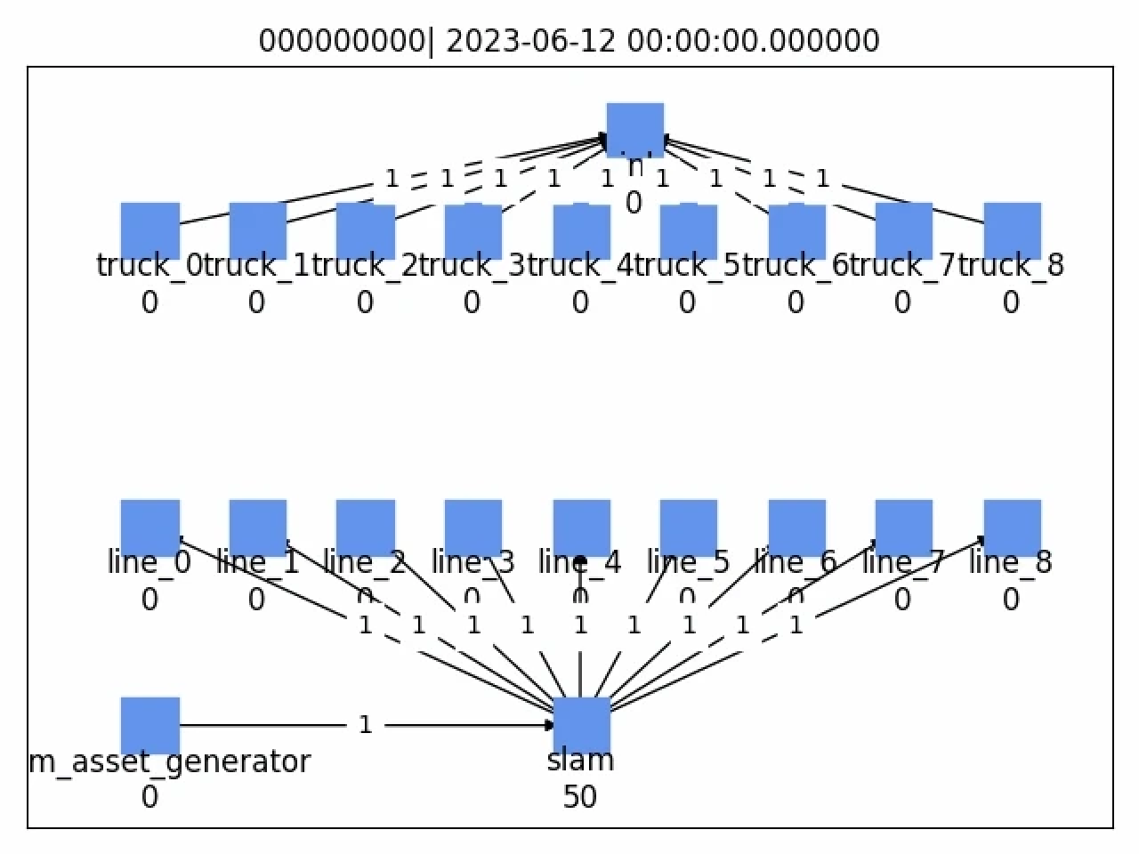
Currently, building these simulations requires manual coding - taking up to 1.5 weeks for even basic setups. This slows us down and limits flexibility, making it harder to respond quickly to evolving customer needs.
With our new simulation tool we're transforming this workflow. A user-friendly interface drastically reduces the time needed to create a simulation from 1.5 weeks to just a few hours.
An iterative, usability-first design process
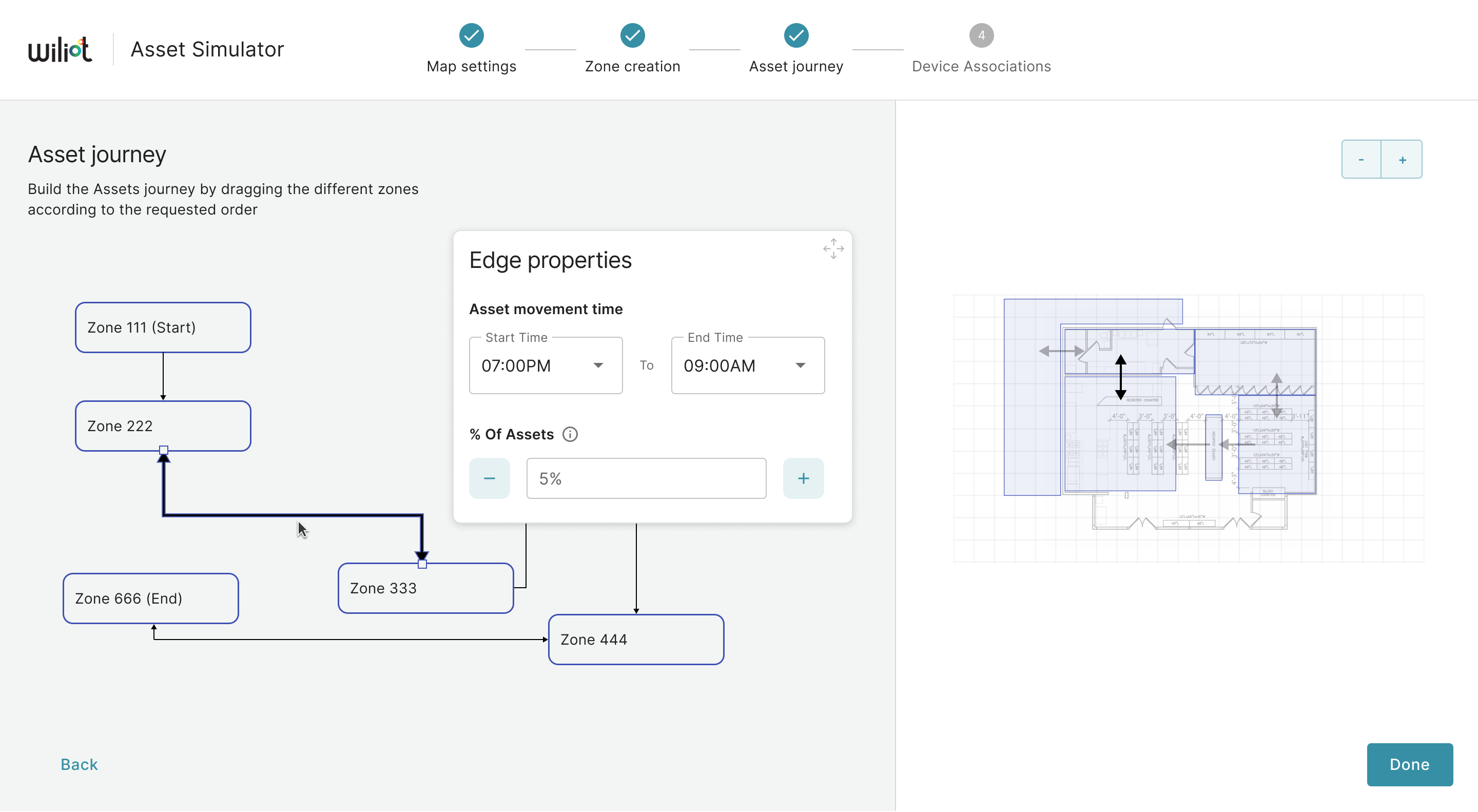
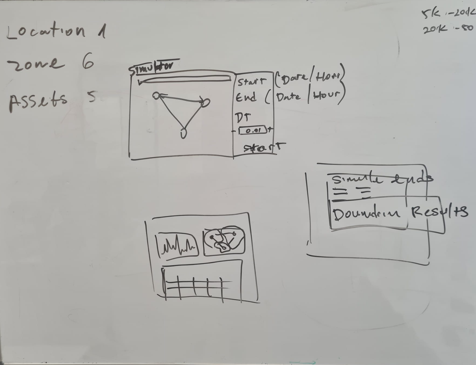
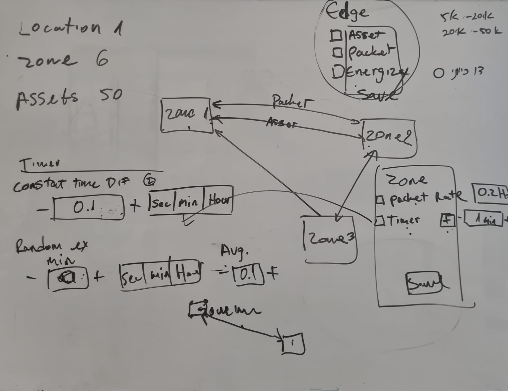
We took an iterative approach with a strong focus on usability. The initial version followed a linear, wizard-style flow, but usability testing revealed it was too rigid and unclear - users struggled to navigate and needed more guidance.
Based on that feedback, we made major design changes to improve flexibility and clarity.
A flexible, user-centered experience
The updated tool replaced the rigid flow with a flexible, non-linear experience, letting users move freely between steps and make changes on the fly.
Simulations can now be customized at any stage, making it easier to adapt to customer needs and deliver more accurate, impactful POCs. As Product Design Lead, I crafted the experience to be intuitive, efficient, and powerful - so even non-technical users could quickly interpret data and make high-impact decisions.
Turning data into decisions
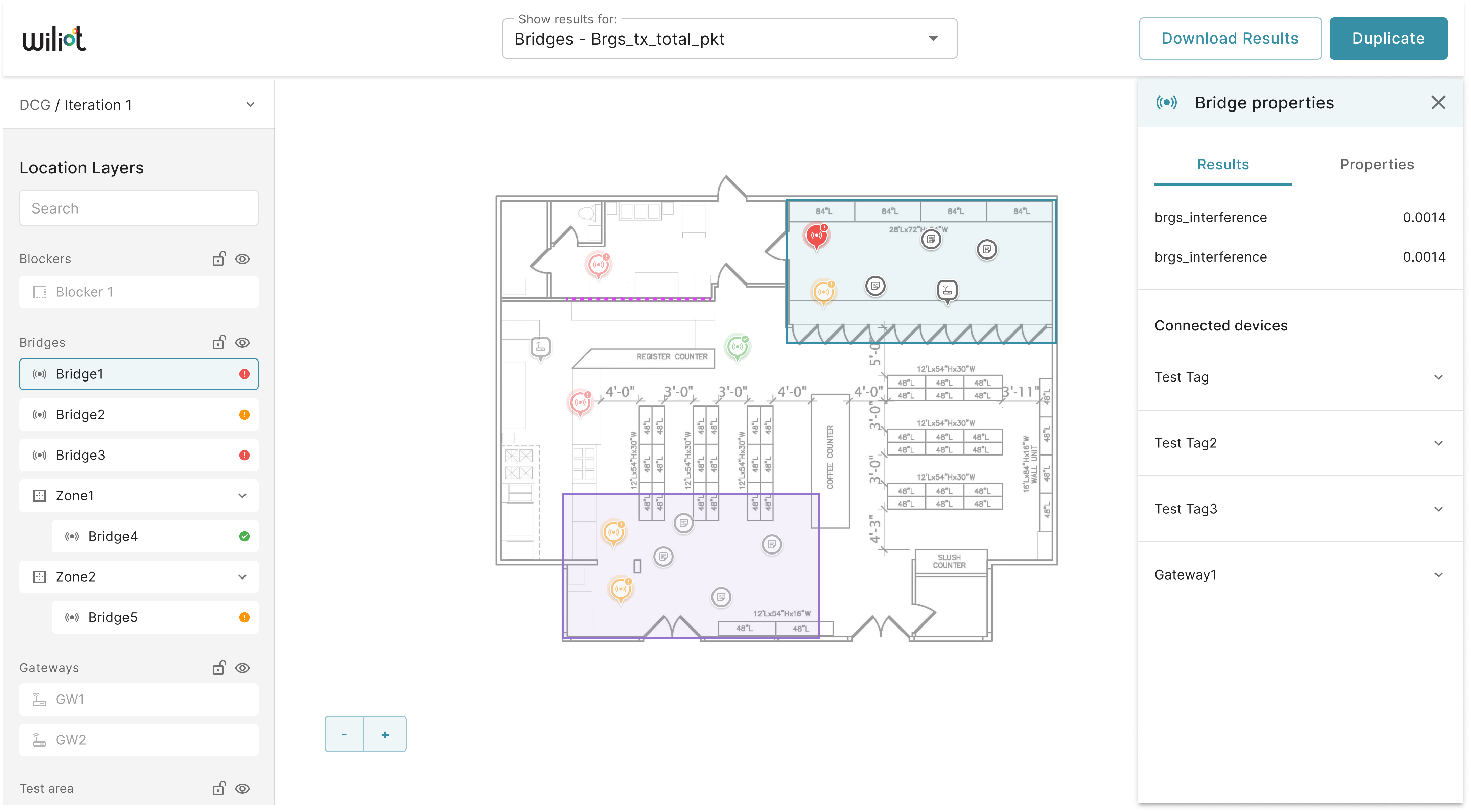
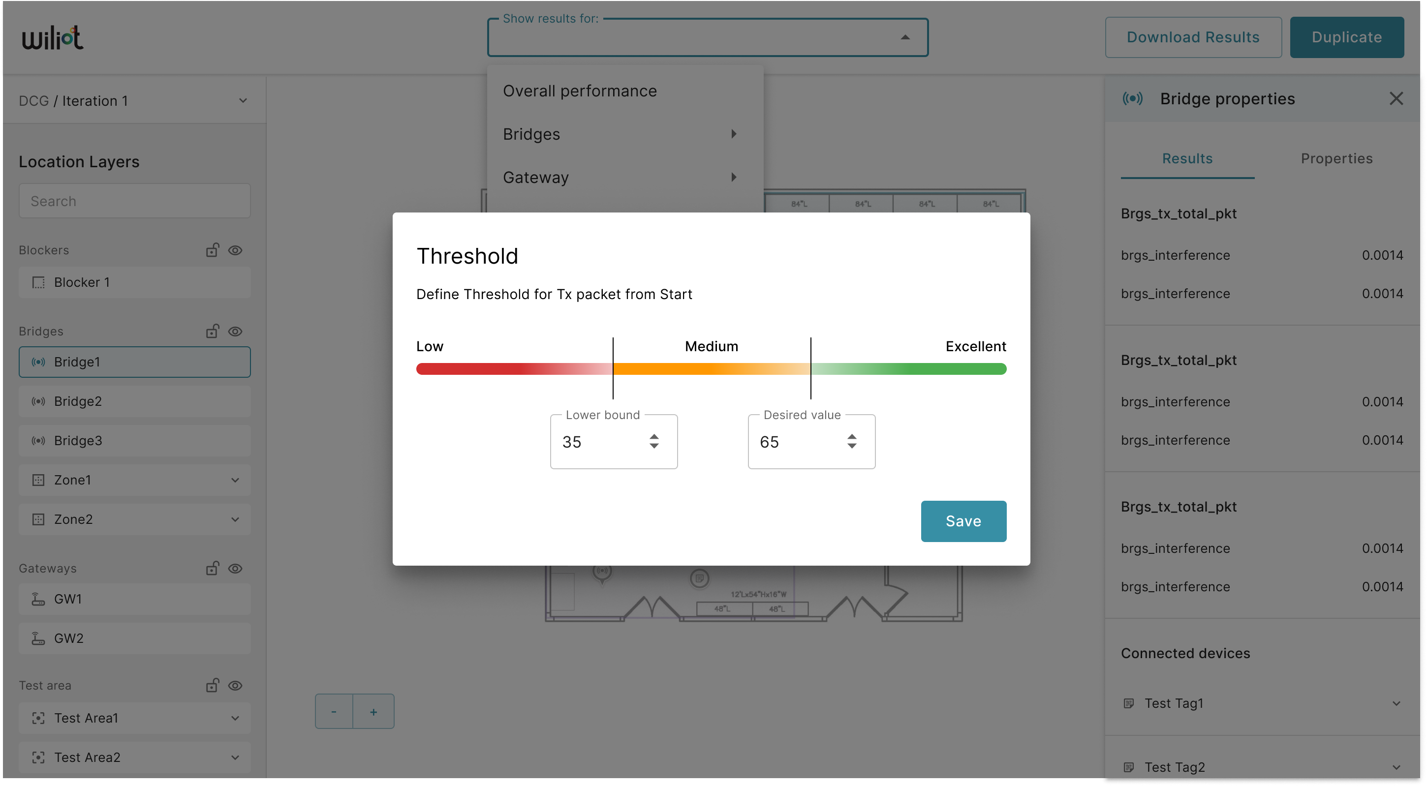
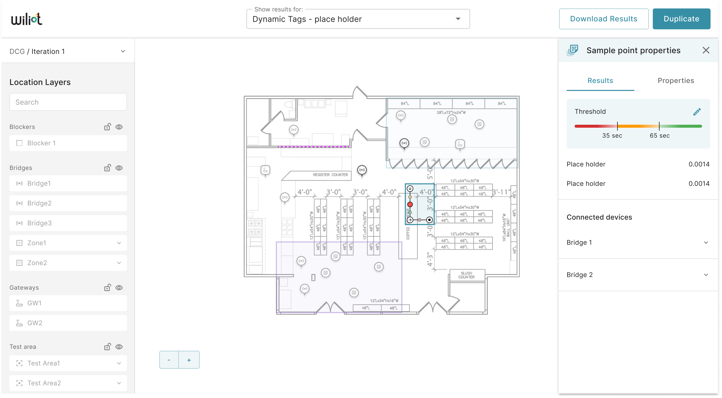
In the results phase, users are empowered to explore and compare all deployed devices directly within the interface:
- Identify performance issues
- Define custom thresholds - what's “good” vs “bad”
- Adjust deployment parameters in real time
- Optimize strategy based on clear, visual feedback
Making complex interactions feel simple
I led the entire UX/UI process for this phase - from early research and wireframing to high-fidelity prototyping and usability testing.
Simplified UX components: dropdown menus, tooltips, and inline help guide users through data entry, ensuring accuracy and ease of use.
Intuitive for first-timers: clear visuals, contextual actions, and lightweight guidance make complex interactions easy to grasp from the start.
Consistency and validation: built-in validation checks guide users toward correct values, reducing errors and rework.
The final result is a tool that bridges the gap between data and decision-making - built for speed, clarity, and confidence.