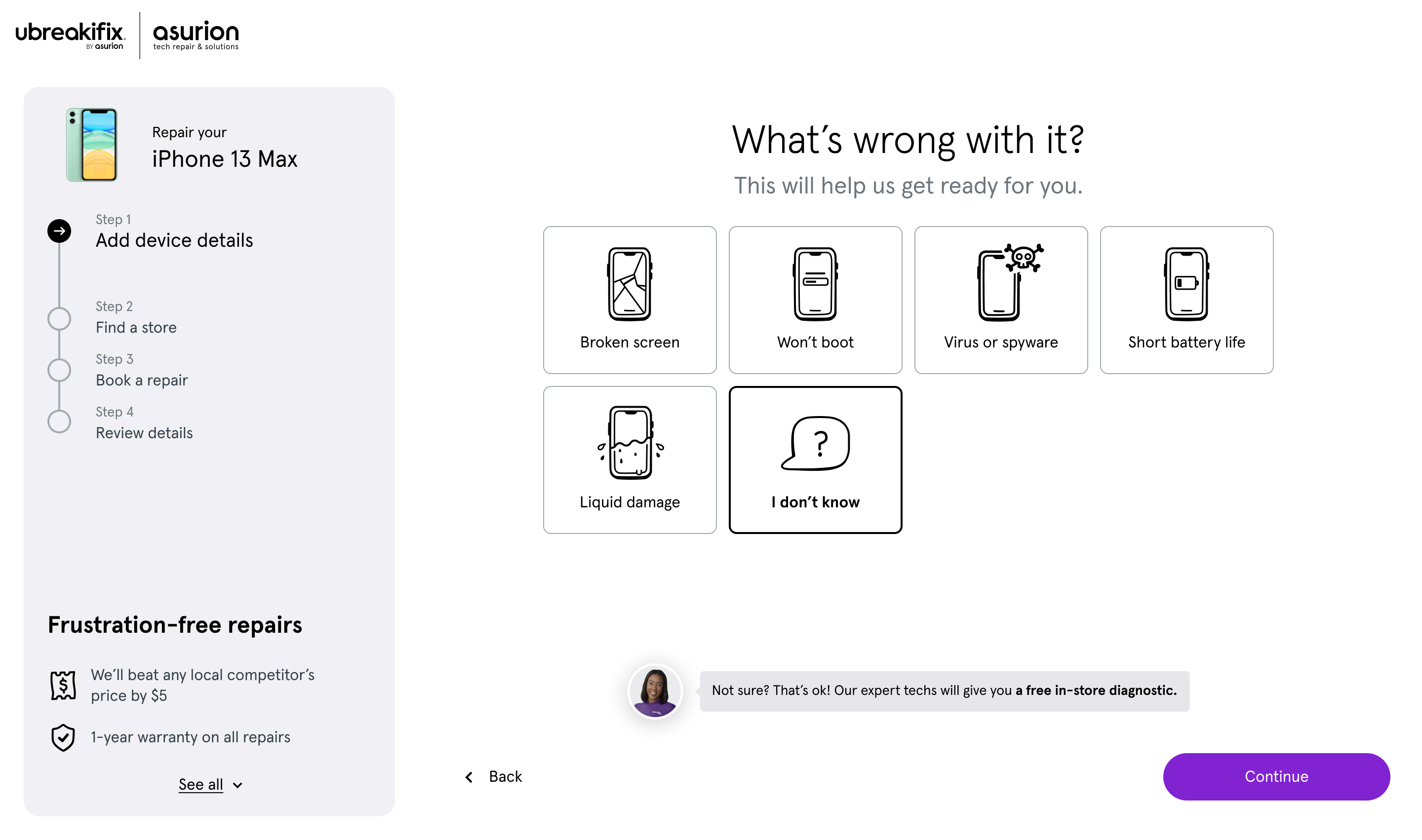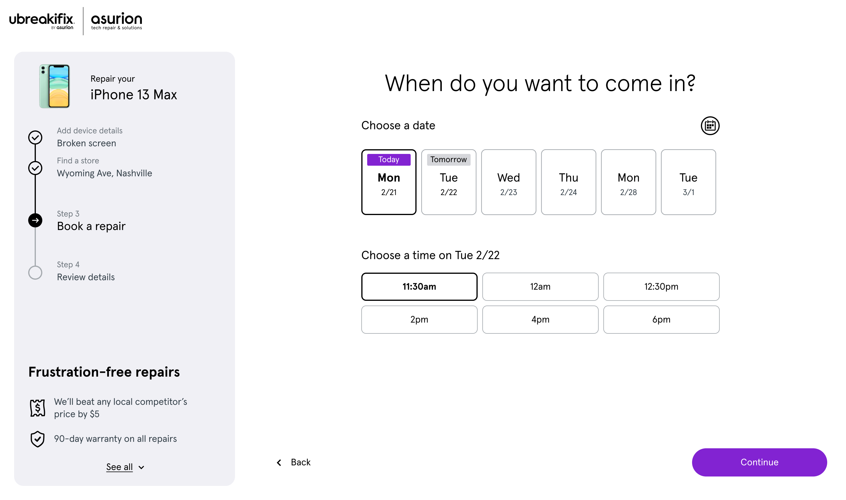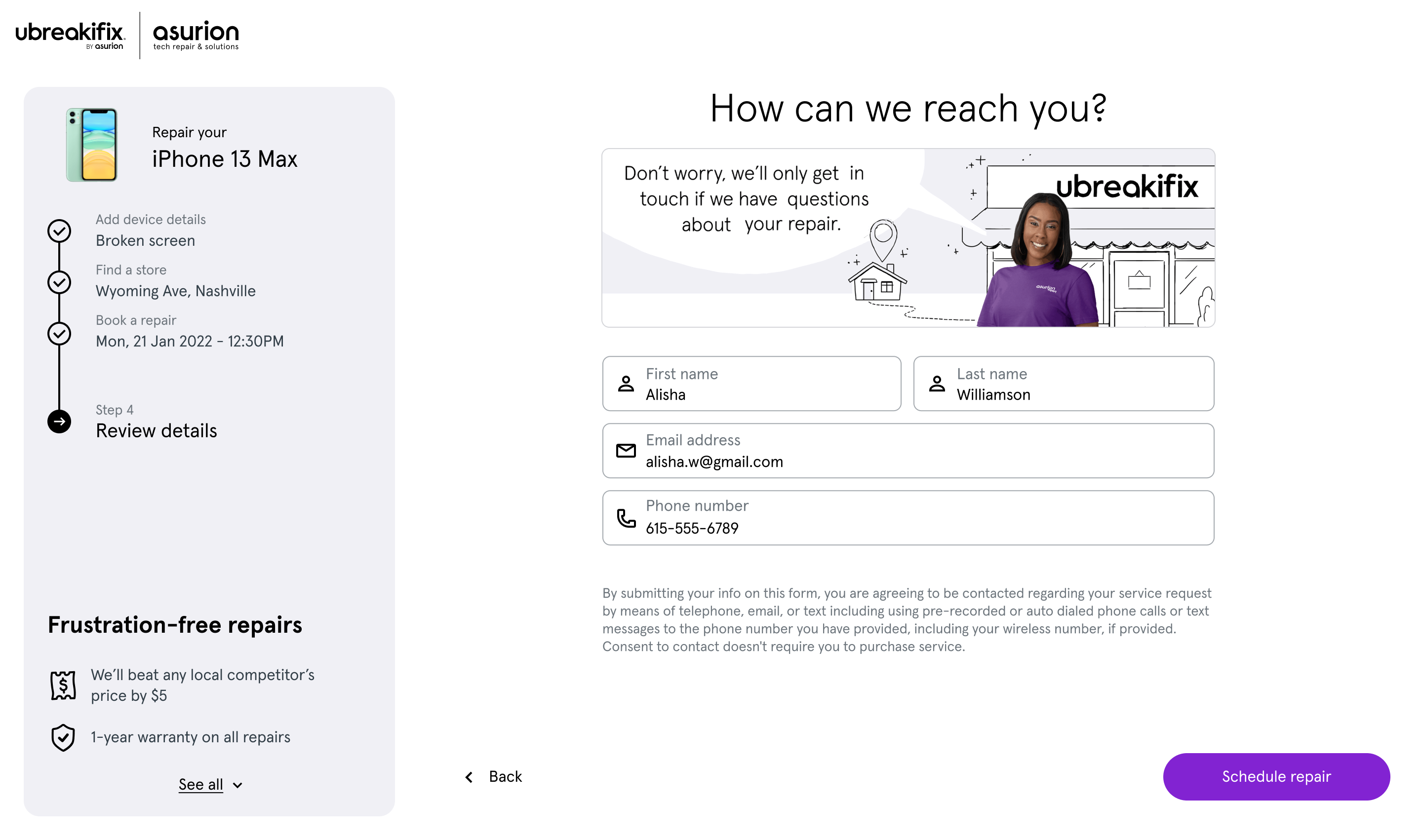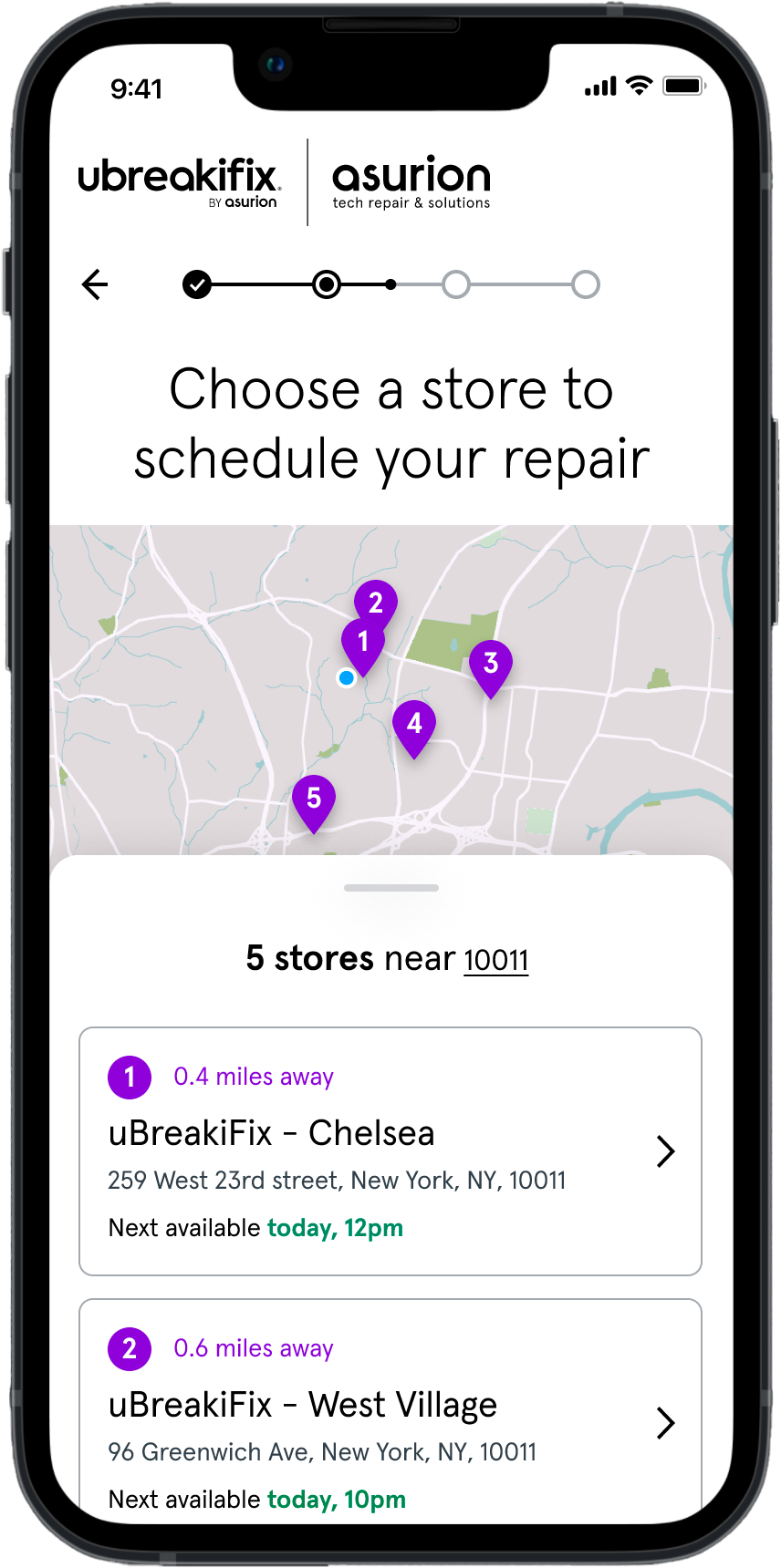
A fast, easy, and fun experience
Because device failures are often stressful and frustrating, it was crucial to design an experience that felt simple, fast, and reassuring. We focused on minimizing steps, surfacing only the most relevant information, and guiding users clearly through each stage.
Large, actionable buttons and short, motivating copy - paired with clean layouts and bright visuals - created a calm, confident environment that encouraged users to move forward with ease.
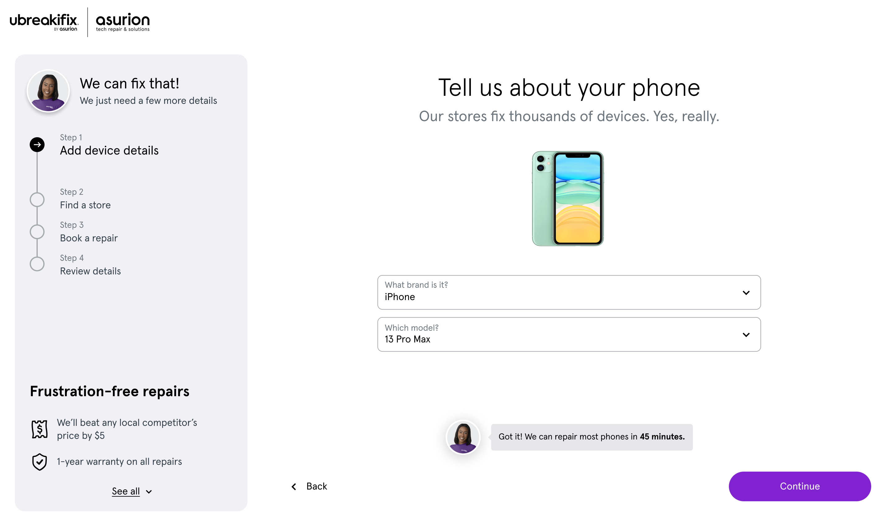


Showing customers we're a step ahead
Transparency was a key pillar, especially around the repair process. Users naturally have a lot of questions in these moments, so our goal was to anticipate their concerns and show we were already thinking ahead.
We introduced a clear progress bar outlining each stage of the journey. Originally long and complex, we worked closely with store teams to streamline it - consolidating steps and removing friction wherever possible.
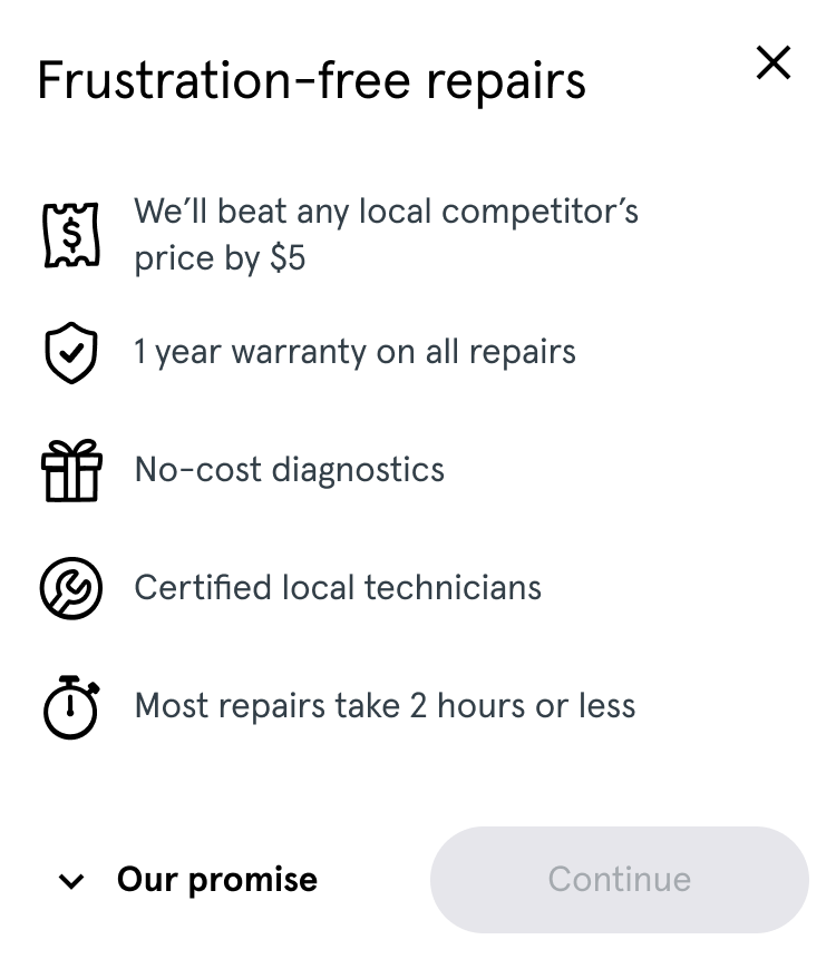
At critical points we added contextual explanations about pricing, timing, and service quality, all written in friendly, down-to-earth microcopy to reassure users and keep the tone approachable.
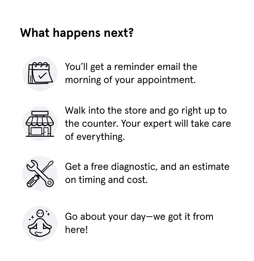
Building trust and reducing barriers
We introduced a virtual sales representative - a friendly face that guided users through the process using clear, conversational language, creating a sense of connection and reassurance.
To further build confidence, we presented all key details upfront, avoiding fine print and ambiguity. One of our most effective solutions was a clear agreement between the user and the store associate - a transparent “contract” that set expectations and reinforced mutual trust.

Carrying the system across desktop
The same principles of speed, clarity, and trust extended to the desktop-first web experience, built on the rebuilt design system.